Marketplace Module

Progress Tabs

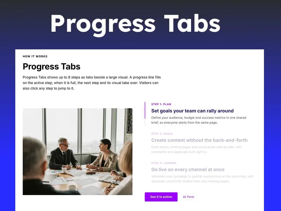
Steps shown as tabs. Progress Tabs shows up to 8 steps as tabs beside a large visual. A progress line fills on the active step; when it is full, the next step and its visual take over. Visitors can also click any step to jump to it. Best for "How it works" sections, onboarding flows, product tours

Progress Tabs

How it works

Launch smarter campaigns in four simple steps

From the first idea to the final report, keep your whole team moving in the same direction, without the spreadsheets, status meetings or guesswork.


pexels

How it works

Progress Tabs

Progress Tabs shows up to 8 steps as tabs beside a large visual. A progress line fills on the active step; when it is full, the next step and its visual take over. Visitors can also click any step to jump to it.


gallery5

Module

Documentation

Steps shown as tabs. A progress line fills on the active step, then the next step and its image take over automatically. Visitors can click any step.

Overview

Progress Tabs shows up to 8 steps as tabs beside a large visual. A progress line fills on the active step; when it is full, the next step and its visual take over. Visitors can also click any step to jump to it.

Key features

  • Autoplay with a progress line, adjustable time per step (2–20 seconds) and optional loop.
  • Click, tap or arrow keys to change steps; pause on hover; a pause/play button.
  • Starts only when the section scrolls into view, so visitors don't miss the first steps.
  • Four transitions for the visual: zoom and blur, fade, slide up, or none.
  • Visual on the left or right on desktop, above or below the steps on mobile.
  • Inactive steps collapse to their labels on phones, so the active step stays in view.
  • Optional section header and call-to-action button.
  1. How filtering works

    1. The first step is active when the section scrolls into view.
    2. Its progress line fills over the time you set, while its visual is shown.
    3. When the line is full, the next step becomes active. After the last step, the module loops back to the first, or stops if Loop is off.
    4. Hovering the steps, pressing Pause, or the visitor's reduced-motion setting stops autoplay. Clicking a step makes it active and restarts its line.

Content fields

Group Fields
Section header Show header, eyebrow, heading, heading level (H1–H4), intro text
Steps (up to 8) Step label, title, description, visual image. A step with no image shows a numbered placeholder.
Button Show button, button text, link
Behavior Autoplay, time per step, loop, pause on hover, only play while on screen, pause/play button, respect reduced motion, autoplay in the editor, collapse inactive steps on mobile
Accessibility labels Steps list label, pause and play button text

Style fields

Group Fields
Text Fonts for the eyebrow, heading, intro, step label, step title and description; uppercase labels
Background and colors Section background, accent (follows the brand kit), line track, inactive step opacity
Button Font, background and hover colors, corner radius, padding
Spacing and alignment Visual position on desktop and mobile, vertical alignment, max width, gaps, section spacing
Progress line Line width, space beside the line, glow
Visual and animation Visual height on desktop and mobile, image fit (contain or cover), transition
  1. Tips

    • Use visuals with the same proportions, so the layout doesn't shift between steps. SVG or transparent PNG works best.
    • Keep descriptions to one or two sentences; 4–6 steps reads best.
    • Leave Autoplay inside the page editor off while editing, so steps don't change under your cursor.

Getting started

Add a module from the page editor's module list, then replace the demo content with your own. No setup is needed in Design Manager.

  1. Install the module from the HubSpot Marketplace. It appears in your portal's module list.
  2. Open a page, landing page or blog template in the editor.
  3. Select Add (the + icon), search for the module's name, and drag it onto the page.
  4. On the Content tab, replace the demo text, images, episodes or items with your own. Repeating items (steps, filters, gallery items, episodes, chapters) have Add buttons and can be reordered by dragging.
  5. On the Style tab, adjust colors, fonts, borders, corners, spacing and animation. Leave fields as they are to keep your brand kit and theme defaults.
  6. Preview the page on desktop and mobile, then publish.

Can't find the module you need?

Tell us what you're building and we'll point you to the right module.